Last time, we discussed that, sadly, according to the State of CSS 2025 survey, trigonometric functions are deemed the “Most Hated” CSS feature.

That shocked me. I may have even been a little offended, being a math nerd and all. So, I wrote an article that tried to showcase several uses specifically for the cos() and sin() functions. Today, I want poke at another one: the tangent function, tan().
CSS Trigonometric Functions: The “Most Hated” CSS Feature
sin()andcos()tan()(You are here!)asin(),acos(),atan()andatan2()(Coming soon)
Before getting to examples, we have to ask, what is tan() in the first place?
The mathematical definition
The simplest way to define the tangent of an angle is to say that it is equal to the sine divided by its cosine.

Again, that’s a fairly simple definition, one that doesn’t give us much insight into what a tangent is or how we can use it in our CSS work. For now, remember that tan() comes from dividing the angles of functions we looked at in the first article.
Unlike cos() and sin() which were paired with lots of circles, tan() is most useful when working with triangular shapes, specifically a right-angled triangle, meaning it has one 90° angle:

If we pick one of the angles (in this case, the bottom-right one), we have a total of three sides:
- The adjacent side (the one touching the angle)
- The opposite side (the one away from the angle)
- The hypotenuse (the longest side)
Speaking in those terms, the tan() of an angle is the quotient — the divided result — of the triangle’s opposite and adjacent sides:

If the opposite side grows, the value of tan() increases. If the adjacent side grows, then the value of tan() decreases. Drag the corners of the triangle in the following demo to stretch the shape vertically or horizontally and observe how the value of tan() changes accordingly.
Now we can start actually poking at how we can use the tan() function in CSS. I think a good way to start is to look at an example that arranges a series of triangles into another shape.
Sectioned lists
Imagine we have an unordered list of elements we want to arrange in a polygon of some sort, where each element is a triangular slice of the polygonal pie.

So, where does tan() come into play? Let’s start with our setup. Like last time, we have an everyday unordered list of indexed list items in HTML:
<ul style="--total: 8">
  <li style="--i: 1">1</li>
  <li style="--i: 2">2</li>
  <li style="--i: 3">3</li>
  <li style="--i: 4">4</li>
  <li style="--i: 5">5</li>
  <li style="--i: 6">6</li>
  <li style="--i: 7">7</li>
  <li style="--i: 8">8</li>
</ul>
Note: This step will become much easier and concise when the sibling-index() and sibling-count() functions gain support (and they’re really neat). I’m hardcoding the indexes with inline CSS variables in the meantime.
So, we have the --total number of items (8) and an index value (--i) for each item. We’ll define a radius for the polygon, which you can think of as the height of each triangle:
:root {
  --radius: 35vmin;
}
Just a smidge of light styling on the unordered list so that it is a grid container that places all of the items in the exact center of it:
ul {
  display: grid;
  place-items: center;
}

li {
  position: absolute;
}
Now we can size the items. Specifically, we’ll set the container’s width to two times the --radius variable, while each element will be one --radius wide.
ul {
  /* same as before */
  display: grid;
  place-items: center;
  /* width equal to two times the --radius */
  width: calc(var(--radius) * 2);
  /* maintain a 1:1 aspect ratio to form a perfect square */
  aspect-ratio: 1;
}

li {
  /* same as before */
  position: absolute;
  /* each triangle is sized by the --radius variable */
  width: var(--radius);
}
Nothing much so far. We have a square container with eight rectangular items in it that stack on top of one another. That means all we see is the last item in the series since the rest are hidden underneath it.
We want to place the elements around the container’s center point. We have to rotate each item evenly by a certain angle, which we’ll get by dividing a full circle, 360deg, by the total number of elements, --total: 8, then multiply that value by each item’s inlined index value, --i, in the HTML.
li {
  /* rotation equal to a full circle divided total items times item index */
  --rotation: calc(360deg / var(--total) * var(--i));
  /* rotate each item by that amount */
  transform: rotate(var(--rotation));
}
Notice, however, that the elements still cover each other. To fix this, we move their transform-origin to left center. This moves all the elements a little to the left when rotating, so we’ll have to translate them back to the center by half the --radius before making the rotation.
li {
  transform: translateX(calc(var(--radius) / 2)) rotate(var(--rotation));
  transform-origin: left center;

  /* Not this: */
  /* transform: rotate(var(--rotation)) translateX(calc(var(--radius) / 2)); */
}
This gives us a sort of sunburst shape, but it is still far from being an actual polygon. The first thing we can do is clip each element into a triangle using the clip-path property:
li {
  /* ... */
  clip-path: polygon(100% 0, 0 50%, 100% 100%);
}
It sort of looks like Wheel of Fortune but with gaps between each panel:
We want to close those gaps. The next thing we’ll do is increase the height of each item so that their sides touch, making a perfect polygon. But by how much? If we were fiddling with hard numbers, we could say that for an octagon where each element is 200px wide, the perfect item height would be 166px tall:
li {
  width: 200px;
  height: 166px;
}
But what if our values change? We’d have to manually calculate the new height, and that’s no good for maintainability. Instead, we’ll calculate the perfect height for each item with what I hope will be your new favorite CSS function, tan().
I think it’s easier to see what that looks like if we dial things back a bit and create a simple square with four items instead of eight.

Notice that you can think of each triangle as a pair of two right triangles pressed right up against each other. That’s important because we know that tan() is really, really good for working with right angles.

Hmm, if only we knew what that angle near the center is equal to, then we could find the length of the triangle’s opposite side (the height) using the length of the adjacent side (the width).

We do know the angle! If each of the four triangles in the container can be divided into two right triangles, then we know that the eight total angles should equal a full circle, or 360°. Divide the full circle by the number of right angles, and we get 45° for each angle.
Back to our general polygons, we would translate that to CSS like this:
li {
  /* get the angle of each bisected triangle */
  --theta: calc(360deg / 2 / var(--total));
  /* use the tan() of that value to calculate perfect triangle height */
  height: calc(2 * var(--radius) * tan(var(--theta)));
}
Now we always have the perfect height value for the triangles, no matter what the container’s radius is or how many items are in it!
And check this out. We can play with the transform-origin property values to get different kinds of shapes!
This looks cool and all, but we can use it in a practical way. Let’s turn this into a circular menu where each item is an option you can select. The first idea that comes to mind for me is some sort of character picker, kinda like the character wheel in Grand Theft Auto V:

…but let’s use more, say, huggable characters:
You may have noticed that I went a little fancy there and cut the full container into a circular shape using clip-path: circle(50% at 50% 50%). Each item is still a triangle with hard edges, but we’ve clipped the container that holds all of them to give things a rounded shape.
We can use the exact same idea to make a polygon-shaped image gallery:
This concept will work maybe 99% of the time. That’s because the math is always the same. We have a right triangle where we know (1) the angle and (2) the length of one of the sides.
tan() in the wild
I’ve seen the tan() function used in lots of other great demos. And guess what? They all rely on the exact same idea we looked at here. Go check them out because they’re pretty awesome:
- Nils Binder has this great diagonal layout.
- Sladjana Stojanovic’s tangram puzzle layout uses the concept of tangents.
- Temani Afif uses triangles in a bunch of CSS patterns.
- In fact, Temani is a great source of trigonometric examples! You’ll see
tan()pop up in many of the things he makes, like flower shapes or modern breadcrumbs.
Bonus: Tangent in a unit circle
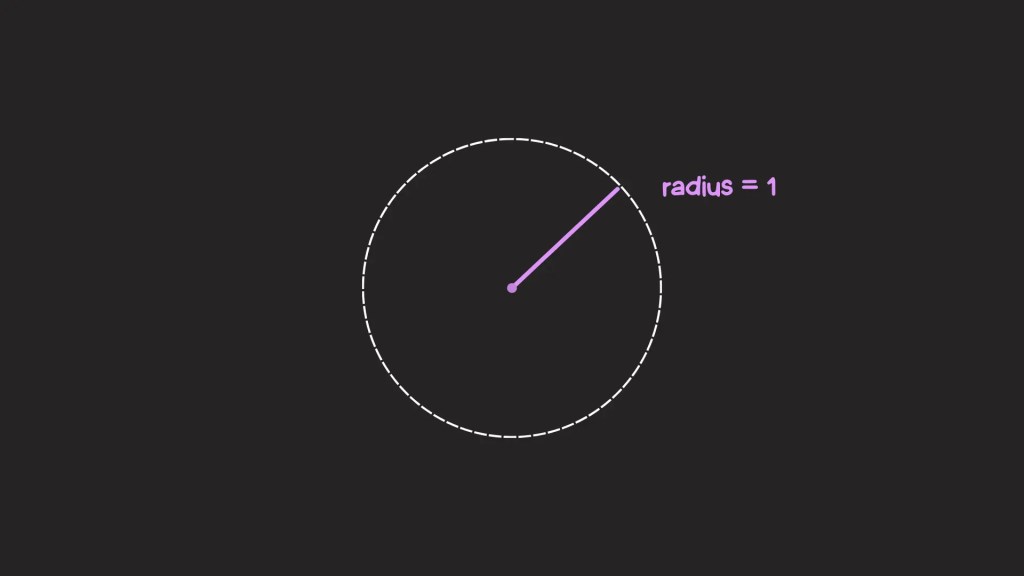
In the first article, I talked a lot about the unit circle: a circle with a radius of one unit:
We were able to move the radius line in a counter-clockwise direction around the circle by a certain angle which was demonstrated in this interactive example:
We also showed how, given the angle, the cos() and sin() functions return the X and Y coordinates of the line’s endpoint on the circle, respectively:
We know now that tangent is related to sine and cosine, thanks to the equation we used to calculate it in the examples we looked at together. So, let’s add another line to our demo that represents the tan() value.
If we have an angle, then we can cast a line (let’s call it L) from the center, and its point will land somewhere on the unit circle. From there, we can draw another line perpendicular to L that goes from that point, outward, along X-axis.
After playing around with the angle, you may notice two things:
- The
tan()value is only positive in the top-right and bottom-left quadrants. You can see why if you look at the values ofcos()andsin()there, since they divide with one another. - The
tan()value is undefined at 90° and 270°. What do we mean by undefined? It means the angle creates a parallel line along the X-axis that is infinitely long. We say it’s undefined since it could be infinitely large to the right (positive) or left (negative). It can be both, so we say it isn’t defined. Since we don’t have “undefined” in CSS in a mathematical sense, it should return an unreasonably large number, depending on the case.
More trigonometry to come!
So far, we have covered the sin() cos() and tan() functions in CSS, and (hopefully) we successfully showed how useful they can be in CSS. Still, we are still missing the bizarro world of trigonometric functions: asin(), acos(), atan() atan2().
That’s what we’ll look at in the third and final part of this series on the “Most Hated” CSS feature of them all.
CSS Trigonometric Functions: The “Most Hated” CSS Feature
sin()andcos()tan()(You are here!)asin(),acos(),atan()andatan2()(Coming soon)
The “Most Hated” CSS Feature: tan() originally published on CSS-Tricks, which is part of the DigitalOcean family. You should get the newsletter.